Your event website needs images. In fact, including great images is one of the 20 critical features that every ticket sales page needs to be successful. Don’t believe me? It’s been proven! Research has found that including images in online posts increases engagement by 650%, and that data applies to your event website, too.
But what do you do if you can’t afford to hire a professional graphic designer to design your event website or even just create images for you to use on your ticket sales page? Not to worry – there are many free and affordable tools that you can use to do it yourself!
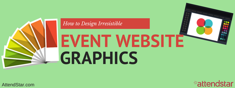
Now, before you start feeling overwhelmed about adding graphic design duties to your already full daily schedule, I’m going to make things easy for you. Below are seven graphic design tips for non-pros that you can use to create irresistible event website graphics all by yourself! I even included a bunch of tools that you can use to get started right away.
1. Fonts
It’s easy to go crazy with fonts when you have access to a lot of them. Resist the urge! Try to stick to using no more than three fonts in your designs. The purpose of mixing fonts is to draw a person’s eye through the design and to important elements. With too many fonts, people won’t know where to look, and your essential messages might get lost in the clutter.
Furthermore, you can give your design a more unique look by investing in fonts that aren’t already included in your graphic design software. FontSquirrel and MyFonts are great sources to find free and affordable fonts. Of course, be sure to read the license agreements and follow the rules when you use them.
2. Color
Just like you shouldn’t go crazy with fonts, you shouldn’t go crazy with color either. Instead, start with a palette that uses only two or three colors (not including photographs if your design includes them).
Like fonts, color should guide a person through the design and call attention to important elements. With too many colors, there are no strategic focal points. The Adobe Color Wheel is a great place to find color inspiration.
3. Images
It’s essential that the images you use are high quality so your event website doesn’t look like an amateur designed it. With this in mind, you should use professional images whenever possible. In addition, make sure you use the right resolution and file type for your images. If the resolution is too low, your images will look blurry. Use JPEG or PNG files for your event website.
Fortunately, there are many affordable stock photo companies that offer images you can include in your event website without worrying about violating any copyright laws. Check out sites like BigStockPhoto, iStockphoto, and 123RF. If you need icons, look at sites like Iconfinder and Iconmonster.
4. Size
Before you add an image or icon to your event website or use one within a graphic you’re creating for your event website, check the file size. The bigger the file size, the longer it will take for the image to load on your website.
According to research by Adobe, 39% of people will stop engaging with your website if the images don’t load or take too long to load. Clearly, compression is very important! If your graphic design software doesn’t offer an option to compress your image files for the web, you can try an online tool like Tinypng or Kraken.
5. Priority
Your event website and graphics should be laid out using a hierarchy, so the most important information you want to communicate is the most obvious, followed by the next most important information, and so on.
Your goal should be to prioritize elements on the page like a map. Once a visitor reads the headline, what should they see next? Create the map first, and then design to match the journey you’ve created with your map.
6. White Space
White space (or negative space) is your friend. No, you don’t have to fill every little space in your graphics or on your web page with images, color, or text. The truth is that white space is extremely important. It gives the eyes a chance to rest, and when used effectively, it can call attention to important pieces of information.
As you learned with fonts and color, clutter is a graphic design killer. White space enables you to group elements and draw emphasis. It has an important purpose, so use it!
7. Layout
Adobe’s research also found that 38% of people will stop engaging with a website if the content or layout is unattractive. That means not only do your images, fonts, colors, and so on need to look great, but the overall layout does, too. Of course, that’s part of graphic design, so it shouldn’t be surprising.
The easiest way to think about layout is using a grid. If you follow the rule of thirds, you’ll be able to create a cohesive layout complete with areas to draw attention to essential elements. Take a few minutes to learn about the Golden Ratio that graphic designers use, and you’ll be ready to lay out your page! Great free and low cost tools to help you create your layouts and all of your graphics are Canva, PicMonkey, GetStencil, and AdobeSpark.
Ready, Set, Design!
Now that you have the tricks and tools to design event website graphics, it’s time to get started. Even if you don’t think you’re a creative person, you will be if you follow the tips discussed above and use the recommended tools.
The key is to create graphics that don’t look too amateurish, or people won’t trust that your event isn’t too amateurish for them. If they don’t trust your event, they won’t buy tickets. Professional looking graphics can make a significant difference in how people perceive your event, so take the time to make them look amazing!
